arviz_plots.plot_khat#
- arviz_plots.plot_khat(elpd_data, threshold=None, show_hlines=False, show_bins=False, hover_label=False, hover_format='{index}: {label}', xlabels=False, legend=None, color=None, hline_values=None, bin_format='{pct:.1f}%', plot_collection=None, backend=None, labeller=None, aes_by_visuals=None, visuals=None, **pc_kwargs)[source]#
Plot Pareto tail indices for diagnosing convergence in PSIS-LOO-CV.
The Generalized Pareto distribution (GPD) is fitted to the largest importance ratios to diagnose convergence rates. The shape parameter \(\hat{k}\) estimates the pre-asymptotic convergence rate based on the fractional number of finite moments. Values \(\hat{k} > 0.7\) indicate impractically low convergence rates and unreliable estimates. Details are presented in [1] and [2].
- Parameters:
- elpd_data
ELPDData ELPD data object returned by
arviz_stats.loocontaining Pareto k diagnostics.- threshold
float, optional Highlight khat values above this threshold with annotations. If None, no points are highlighted.
- show_hlinesbool, default
False Show horizontal reference lines at diagnostic thresholds.
- show_binsbool, default
False Show the percentage of khat values falling in each bin delimited by reference lines.
- hover_labelbool, default
False Enable interactive hover annotations when using an interactive backend.
- hover_format
str, default"{index}: {label}" Format string for hover annotations. Supports
{index},{label}, and{value}.- xlabelsbool, default
False Show coordinate labels as x tick labels.
- legendbool, optional
Whether to display a legend when color aesthetics are active. If None, a legend is shown when a color mapping is available.
- color
colorspecorstr, optional Color for scatter points when no aesthetic mapping supplies one. If the value matches a dimension name, that dimension is mapped to the color aesthetic.
- hline_valuessequence of
float, optional Custom horizontal line positions. Defaults to [0.0, 0.7, 1.0].
- bin_format
str, default"{pct:.1f}%" Format string for bin percentages. Supports
{count}and{pct}placeholders.- plot_collection
PlotCollection, optional - backend{“matplotlib”, “bokeh”, “plotly”}, optional
Plotting backend to use. Defaults to
rcParams["plot.backend"].- labeller
labeller, optional - aes_by_visualsmapping of {
strsequence ofstrorFalse}, optional Mapping of visuals to aesthetics that should use their mapping in
plot_collectionwhen plotted. Valid keys are the same as forvisuals.By default:
khat -> uses all available aesthetic mappings
hlines -> uses no aesthetic mappings
bin_text -> uses no aesthetic mappings
threshold_text -> uses no aesthetic mappings
title -> uses no aesthetic mappings
xlabel -> uses no aesthetic mappings
ylabel -> uses no aesthetic mappings
ticks -> uses no aesthetic mappings
- visualsmapping of {
strmapping or bool}, optional Valid keys are:
khat -> passed to
scatter_xyhlines -> passed to
hlinebin_text -> passed to
annotate_xythreshold_text -> passed to
annotate_xytitle -> passed to
labelled_titledefaults to Falsexlabel -> passed to
labelled_xylabel -> passed to
labelled_ylegend -> passed to
arviz_plots.PlotCollection.add_legendticks -> passed to
set_xticks
- **pc_kwargs
Passed to
arviz_plots.PlotCollection.wrap.
- elpd_data
- Returns:
Warning
When using custom markers via the
visualsdict, ensure the marker type is compatible with your chosen backend. Not all marker types support separate facecolor and edgecolor across different backends.References
[1]Vehtari et al. Practical Bayesian model evaluation using leave-one-out cross-validation and WAIC. Statistics and Computing. 27(5) (2017). https://doi.org/10.1007/s11222-016-9696-4. arXiv preprint https://arxiv.org/abs/1507.04544.
[2]Vehtari et al. Pareto Smoothed Importance Sampling. Journal of Machine Learning Research, 25(72) (2024) https://jmlr.org/papers/v25/19-556.html arXiv preprint https://arxiv.org/abs/1507.02646
Examples
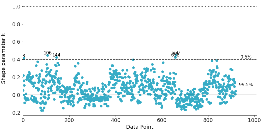
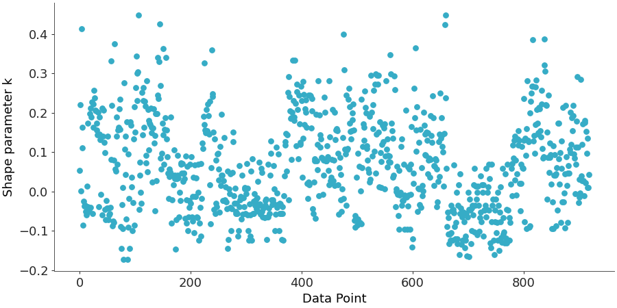
The most basic usage plots the Pareto k values from a LOO-CV computation. Each point represents one observation, with higher k values indicating less reliable importance sampling for that observation.
>>> from arviz_plots import plot_khat, style
>>> style.use("arviz-variat")
>>> from arviz_base import load_arviz_data
>>> from arviz_stats import loo
>>> dt = load_arviz_data("radon")
>>> elpd_data = loo(dt, pointwise=True)
>>> plot_khat(elpd_data, figure_kwargs={"figsize": (10, 5)})
We can highlight problematic observations by setting a
thresholdand add reference lines withshow_hlines=Trueto visualize the diagnostic boundaries. Usingshow_bins=Truedisplays the percentage of observations falling into each diagnostic category. Note that thehline_valuesparameter is independent of thethresholdparameter. To draw a horizontal line at your custom threshold, you must set both parameters explicitly.>>> plot_khat(elpd_data, >>> threshold=0.4, >>> show_hlines=True, >>> show_bins=True, >>> hline_values=[0.0, 0.4, 1.0], >>> visuals={"hlines": {"color":"B1"}}, >>> figure_kwargs={"figsize": (10, 5)} >>> )